Blackletter (Gothic) Calligraphy Guide: uses, sizes and printing tips
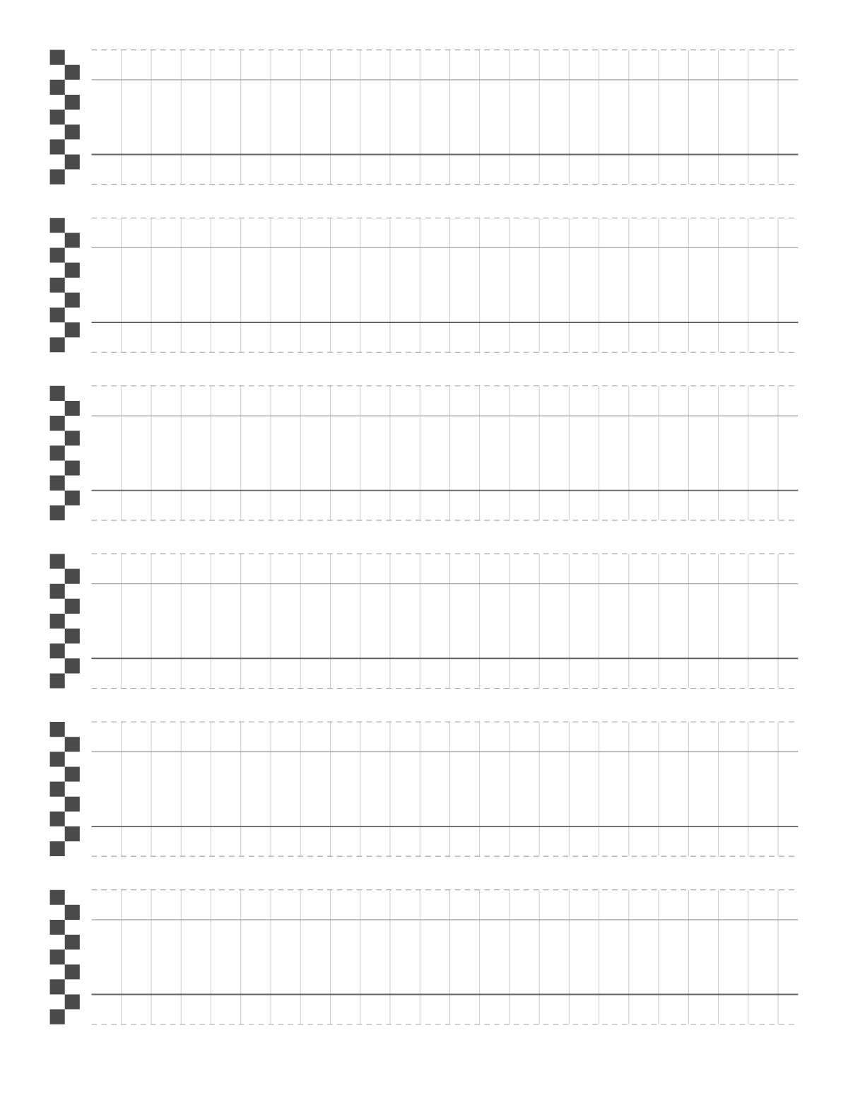
Textura, the classic Gothic blackletter, is upright and compact: an x-height of about five nib widths with short ascenders and descenders. Vertical guide lines help keep the dense, regular rhythm of the strokes.
How to print it
- Choose the paper size (US Letter, A4, Legal, A5 or Half Letter) and portrait or landscape — the page updates as you change settings.
- Choose a pointed pen / brush layout with an x-height in millimeters, or a broad-edge layout measured in nib widths, then the slant angle.
- Add a title or a name/date header if you want, or keep the page plain.
- Click Print / Save as PDF. In the print dialog choose “Actual size” (100%) and turn off “Headers and footers”.
Tips
- Keep the white space between strokes equal to the stroke width.
- Rule the page to your pen: for broad-edge hands, the x-height is measured in nib widths, so a wider nib needs taller guidelines.
- Slant lines are guides, not rules — keep the angle of downstrokes consistent with them.
FAQ
Why are the ascenders so short?
Blackletter is tightly packed; ascenders and descenders are only about two nib widths.
Which pen angle is used?
About 40–45° for textura.
What do the guidelines mean?
From top to bottom: the ascender line (dashed), the waistline (top of the x-height), the baseline (darker) and the descender line (dashed). Small letters sit between the waistline and the baseline.
Is it free, and do I need an account?
It is completely free with no sign-up and no download. Change the settings, print it or save it as a PDF, and bookmark the address — your settings are stored in the link.
Related paper


More Handwriting & Calligraphy: Handwriting Practice Paper · Kindergarten Writing Paper · Primary Writing Paper · First Grade Writing Paper · Story Paper · Cursive Writing Paper · Four Line Handwriting Paper · Spencerian Script Practice Sheets · Genkouyoushi (Japanese Manuscript Paper) · Tianzige Chinese Writing Paper · Mizige Calligraphy Grid Paper · Korean Wongoji Paper
↑ Customize and print the Blackletter (Gothic) Calligraphy Guide